Z SUPPLY Eyewear Landing Page
Eyewear from sunrise to sunset.
TIMELINE:
4.5 weeks
TEAM:
Z SUPPLY e-commerce team
MY ROLE:
Product Designer, Project Manager
TOOLS:
Figma, Adobe Photoshop, Asana, Google Sheets
THE NEED:
Online presence and home for our Z SUPPLY customers to learn more about our new eyewear collection and purchase their best fit sunglasses.
01. IDEATION + GOALS
Our goal is to create a dedicated landing page for our newest division launch that not only promotes our products, but educates customers on why our products stand out against the rest and recommends their best fit sunglasses.
According to the consumer decision journey report done by Luxottica, many of the interviewees in their study preferred not to purchase sunglasses online because they need to try them on. Since Z SUPPLY is an online-only brand, we had to innovate a way for customers to still purchase our sunglasses without an already present baseline reference for fit.
QUIZ FEATURE CONCEPT:
We took a look at other existing brands and found that some of them had an eyewear quiz while others had virtual try-ons. Considering our bandwidth, turnaround time, and budget, we decided to opt for the quiz.
There were suggestions from the team on using a third party plug-in for the quiz, but after conceptualizing the quiz logic and interaction, I proposed for us to create the quiz in-house. Not only will we have better flexibility and control over the creative to match our branding, the quiz logic can already be referenced from our filters panel via code. All that’s needed was data for the quiz as well as the UI.
TASK FLOW:
1. Learn about our all polarized collection
2. Browse the collection
3. Take the quiz
4. Look through results
5. Purchase from results page or collection page
02. WIREFRAMING + PROTOTYPING
My team and I wanted to have the right balance of visual creative, educational information, and features on site. We prioritized the hierarchy of information and features and supplemented them with creative assets as we content-chunked each section.
04. HANDOFF + TESTING
After three rounds of feedback and approvals for the prototype, the prototype was ready for development. The biggest challenge of this landing page was making sure the quiz was operating smoothly — specifically with its micro-interactions and result population.
We found that our initial data sheet was too specific with its selections and was more susceptible to not populating any results for the user. We revised our data sheet to cater to a wider selection of options. Days ahead of the launch, I reached out to fellow peers in our company to take the quiz and screenshot their results. Each employee was able to have at least one to two pairs of sunglasses recommended to them, which allowed us to move forward with the launch.
KEY TAKEAWAYS
I really enjoyed innovating and problem-solving when working on this project. This was one of my favorite product design projects since I was able to oversee and carry through the idea from start to finish. This was a beast of a landing page we’ve had to tackle, but I loved being challenged every step of the way.
FUN FACT
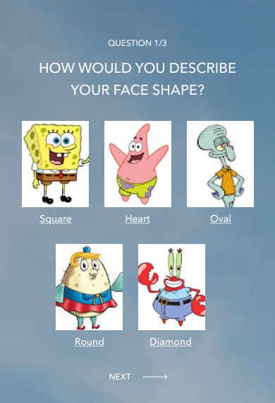
While waiting on the face shape illustrations for the eyewear quiz, I used Spongebob characters as placeholder images for my mid-fidelity prototype. The characters I used to represent face shapes seemed pretty spot on — though I’m not sure how I would feel if someone compared my oval face to that of Squidward’s.


